


|
GENERAL OFFICES |
SP35, SP41, SP30, LW, CW, WW |
|
Color-important areas |
SPX35, SPX41, SPX30, SP35, SP30 |
|
Color-critical areas |
C50, CWX, WWX, SPX35, SPX41, SPX30 |
|
RETAIL STORES |
|
|
Food, Drug, Variety, Hardware |
SPX35, SPX30, SPX41, SP35, SP30, SP41 |
|
Meat display |
SPX30, SPX35, SPX41, CWX, WWX, SP30, SP35, N,
plus Incandescent |
|
Jewelry |
CWX, C50, SPX41, SP41, plus Incandescent |
|
Florist |
CWX, C50, SPX41, SPX35, SP35, SP41 |
|
Shoe |
SPX35, SPX30, SP35, SP41, SP30, CWX, WWX |
|
Women's Wear |
SPX30, SPX35, SPX41, SP30, SP35, WWX, CWX,
SP41 |
|
Men's Wear |
SPX35, SPX41, SP35, SP41, CWX |
|
INDUSTRIAL |
|
|
General |
LW, SP35, SP41, SP3O, CW, WW |
|
Printing |
C50, C75, (ANSI Std. PH2.32-1972) |
|
Textile (color checking) |
C50 |
|
Paint (color checking) |
C50, CWX |
|
Meat (Inspection) |
CWX, C50 |
|
PUBLIC BUILDINGS |
|
|
Museums |
CWX, C50, SPX35, SPX41, SPX30, WWX |
|
Hotels/Motels |
SPX30, SPX35, SPX41, SP30, SP35, SP41 |
|
Hospitals |
CWX, SPX35, SPX30, SPX41, WWX, SP35, SP30,
SP41 |
|
-Nurseries |
C50 |
|
-Labs (color critical) |
C50, CWX |
|
-Treatment, intensive care, etc. |
CWX, C50 |
|
Clear Mercury |
Landscape lighting, specialized floodlighting
such as green copper roofs. |
|
DX Mercury |
Stores, public spaces-Multi-Vapor lamps;
however, are preferred. |
|
WDX Mercury |
Stores�Multi-Vapor. Il lamps, are preferred. |
|
MV |
Stores, public spaces, industrial, gymnasiums,
floodlighting signs & buildings, parking areas, sports. |
|
MV/C |
Same as MV�warmer color�diffuse coating
reduces brightness. |
|
MY/II |
Stores, public spaces�warmer color. Similar
in chromaticity to incandescent. |
|
LU |
Street lighting, parking areas, industrial,
floodlighting, security, CCTV. |


|
Lamp |
Nominal |
x, y |
CRI |
CCT {K) |
Whiteness |
Colors Enhanced |
Colors Greyed |
Notes |
|
|
|
|
|
|
|
|
|
|
|
WW |
81.3 |
x = .440 |
52 |
3000 |
Yellowish |
Orange, Yellow |
Red, Blue, Green |
|
|
W |
80.0 |
x = .409 |
60 |
3450 |
Pale Yellowish |
Orange, Yellow |
Red, Blue, Green |
|
|
CW |
78.8 |
x = .372 |
62 |
4150 |
White White |
Yellow, Orange, Blue |
Red |
|
|
LW |
83.8 |
x = .379 |
49 |
4200 |
Pale Greenish |
Yellow, Blue |
Red, Orange |
|
|
D |
65.0 |
x = .313 |
75 |
6250 |
Bluish |
Green, Blue |
Red, Orange |
|
|
SP30 |
81.3 |
x = .440 |
70 |
3000 |
Yellowish |
Red, Orange |
Deep Red, Blue |
|
|
SP35 |
82.0 |
x = .413 |
73 |
3500 |
Pale Yellowish |
Red, Orange Green |
Deep Red |
Rare-earth Phosphors |
|
SP41 |
82.0 |
x = .376 |
70 |
4100 |
Pale Greenish |
Red, Orange |
Deep Red Green, Blue |
Rare-earth Phosphors |
|
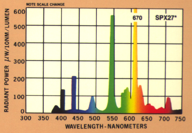
SPX27 |
� |
x = .463 |
81 |
2700 |
Warm Yellow |
Red, Orange |
Blue |
Rare-earth Phosphors |
|
SPX30 |
81.5 |
x = .437 |
82 |
3000 |
White (Pinkish) |
Red, Orange, Yellow |
Deep Red |
Rare-earth Phosphors |
|
SPX35 |
82.5 |
x = .413 |
82 |
3500 |
White |
Red, Orange Yellow, Green |
Deep Red |
Rare-earth Phosphors |
|
SPX41 |
84.3 |
x = .376 |
82 |
4100 |
White White |
All |
Deep Red |
Rare-earth Phosphors |
|
WWX |
55.0 |
x = .437 |
77 |
3025 |
Yellowish |
Red, Orange, Yellow Green |
Blue |
Simulates Incandescent |
|
CWX |
56.3 |
x = .371 |
89 |
4175 |
White (Pinkish) |
All |
None |
Simulates outdoor daylight |
|
C50 |
55.3 |
x = .346 |
90 |
5000 |
(Bluish) |
|
None |
Simulates sunlight |
|
C75 |
50.0 |
x = .300 |
92 |
7500 |
Bluish |
All |
None |
Simulates North skylight clear |
|
N |
52.5 |
x = .388 |
90 |
3700 |
Pinkish |
Red, Orange |
Blue |
Flatters complexions, meat displays
seml-"cosmetic" |
|
SGN |
60.0 |
x = .334 |
82 |
5200 |
(Bluish) |
All |
None |
Deluxe color for plastic signs |
|
PL |
21.3 |
x = .320 |
-2 |
6750 |
Purplish |
Blue, Deep Red |
Green, Yellow |
Plant/Flower enhancement & growth |
|
PL/AQ |
46.6 |
x = .408 |
90 |
3050 |
Pale Purplish |
Blue, Deep Red |
Green, Yellow |
Plant/Flower enhancement & growth |
|
CG |
71.3 |
x = .307 |
68 |
6450 |
Greenish White |
Yellow, Green |
Red, Blue |
|
|
INC. |
17.5 |
x = .445 |
99+ |
2900 |
Yellowish |
Deep Red, Red Orange Yellow |
Blue Green |
|
|
H175 |
45.4 |
x = .326 |
15 |
5710 |
Blue, Green |
Blue, Green |
Red, Orange |
Poor overall color rendering |
|
H175 |
49.1 |
x = .388 |
50 |
3900 |
Pale Purplish |
Blue, Red |
Green |
Shifts to greenish over life |
|
H175 |
40.0 |
x = .413 |
50 |
3300 |
Pinkish |
Blue, Red |
Green |
Shifts to greenish over life |
|
MVR |
80.0 |
x = .384 |
65 |
4100 |
White |
Blue, Green, Yellow |
Red |
Shifts to pinkish over life |
|
MVR |
80.0 |
x = .398 |
70 |
3900 |
White |
Blue, Green, Yellow |
Red |
Shifts to pinkish over life |
|
MXR |
91.4 |
x = .427 |
65 |
3100 |
Yellowish |
Red, Orange, Yellow, Green |
Red |
Shifts cooler over life |
|
LU250 |
110.0 |
x = .512 |
21 |
2100 |
Yellowish |
Yellow |
Red, Blue |
|
|
LU |
90.0 |
x = .505 |
65 |
2200 |
Yellowish White |
Red, Green, |
Deep Red Deep Blue |
CRI decreases slightly over life |